Enhancing User Flows through Architecture and Brand Clarity
Green Columbus · August 2024 - April 2025
Responsibilities
- UI Design
- Web Development
Tools


Figma
Executive Summary
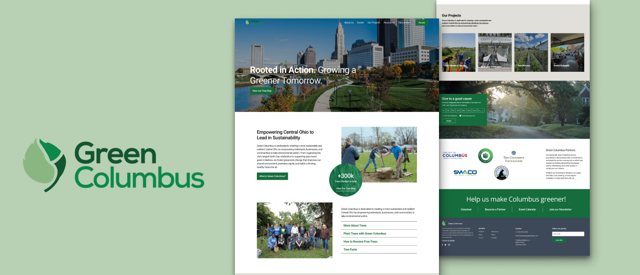
This case study presents a conceptual redesign of the Green Columbus website, focused primarily on the landing page. The goal of the redesign was to improve user engagement, elevate the organization’s digital presence, and more effectively communicate its impact. The original website struggled to direct visitors toward key actions and did not adequately showcase the quantitative success of Green Columbus’s environmental initiatives.
The new landing page was re-imagined to feature prominent calls to action, guiding users into relevant engagement funnels such as volunteering, donating, and participating in events. The visual design was modernized to align with the organization's mission and values, giving the site a more credible and professional appearance.


Getting Started with Analytics
Initial exploration started with a touch base with the website stakeholders to review their analytics and to understand what the primary activations of the website were and how it fit into the organizations conversion funnel. In reviewing the website analytics, the following was found:
- Traffic peaked at two major times in the year: in April around Earth Day and in association with the month of service, and in Late August to September when the organization gives away trees
- Part of the Earth Day traffic would be muted as there’s a separate Earth Day event website
- 60% of traffic came on mobile devices
- On average, the website had a ~60% Bounce Rate.
- Traffic was 67% direct, 24% Search, and 10% Social Media or other
- Specific resource pages had high visit rate but also high bounce rate.
Takeaways
- It’s important for mobile view experience to be refined as the majority of users come from there.
- Landing page should more comprehensively set up with links to further content to reduce bounce rate.
- Many of the navigation links were not getting attention and could be cleaned up to fascilitate conversion funnels

Information Architecture
Analytics suggested that the highest engagement by far was towards Free Tree registration around August and September. While it successfully fulfilled that purpose, it demonstrated there could be issues with the intended primary activations, i.e. event engagement, signing up to the newsletter to receive more information, signing up as a volunteer, partnering with Green Columbus, or donating with Green Columbus.
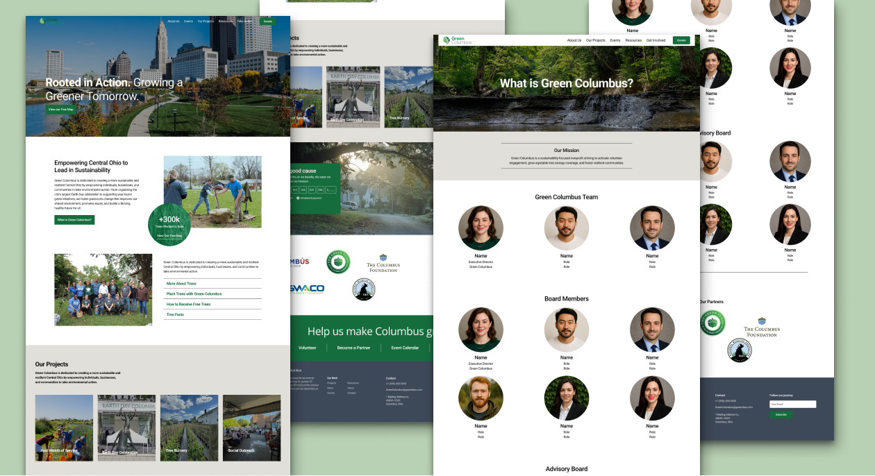
After considering analytics and other platform references, the decision was made to ensure there were either calls to action or blurbs for all of our important conversions on the landing page. After a few iterations, the following sitemap was approve.
Outcome
This project was a valuable exercise in framing design solutions with quantifiable analytics.The final design featured a cleaner layout with clearly defined calls to action, intuitive navigation, and strategic content placement. Key user flows—like volunteering and donating—were made more accessible and visually prominent, encouraging conversion.
The redesign also improved credibility by showcasing impact statistics (e.g., number of trees planted, volunteers mobilized), establishing trust with first-time visitors and reinforcing the organization’s accomplishments.

From sticky product challenges to shaping design culture, I love creating solutions that make an impact.
If you’re looking for a fresh perspective, let’s chat 👋
Socials


Enhancing User Flows through Architecture and Brand Clarity
Green Columbus · August 2024 - April 2025
Responsibilities
- UI Design
- Web Development
Tools
Figma
Executive Summary
This case study presents a conceptual redesign of the Green Columbus website, focused primarily on the landing page. The goal of the redesign was to improve user engagement, elevate the organization’s digital presence, and more effectively communicate its impact. The original website struggled to direct visitors toward key actions and did not adequately showcase the quantitative success of Green Columbus’s environmental initiatives.
Getting Started with Analytics
Initial exploration started with a touch base with the website stakeholders to review their analytics and to understand what the primary activations of the website were and how it fit into the organizations conversion funnel. In reviewing the website analytics, the following was found:
- Traffic peaked at two major times in the year: in April around Earth Day and in association with the month of service, and in Late August to September when the organization gives away trees
- Part of the Earth Day traffic would be muted as there’s a separate Earth Day event website
- 60% of traffic came on mobile devices
- On average, the website had a ~60% Bounce Rate.
- Traffic was 67% direct, 24% Search, and 10% Social Media or other
- Specific resource pages had high visit rate but also high bounce rate.
Takeaways
- It’s important for mobile view experience to be refined as the majority of users come from there.
- Landing page should more comprehensively set up with links to further content to reduce bounce rate.
- Many of the navigation links were not getting attention and could be cleaned up to fascilitate conversion funnels
Information Architecture
Analytics suggested that the highest engagement by far was towards Free Tree registration around August and September. While it successfully fulfilled that purpose, it demonstrated there could be issues with the intended primary activations, i.e. event engagement, signing up to the newsletter to receive more information, signing up as a volunteer, partnering with Green Columbus, or donating with Green Columbus.
After considering analytics and other platform references, the decision was made to ensure there were either calls to action or blurbs for all of our important conversions on the landing page. After a few iterations, the following sitemap was approve.
Outcome
This project was a valuable exercise in framing design solutions with quantifiable analytics.The final design featured a cleaner layout with clearly defined calls to action, intuitive navigation, and strategic content placement. Key user flows—like volunteering and donating—were made more accessible and visually prominent, encouraging conversion.
The redesign also improved credibility by showcasing impact statistics (e.g., number of trees planted, volunteers mobilized), establishing trust with first-time visitors and reinforcing the organization’s accomplishments.
From sticky product challenges to shaping design culture, I love creating solutions that make an impact.
If you’re looking for a fresh perspective, let’s chat 👋
Socials
Pages
Work
Extras
Resources
My Resume
Enhancing User Flows through Architecture and Brand Clarity
Green Columbus · August 2024 - April 2025
Responsibilities
- UI Design
- Web Development
Tools
Figma
Executive Summary
This case study presents a conceptual redesign of the Green Columbus website, focused primarily on the landing page. The goal of the redesign was to improve user engagement, elevate the organization’s digital presence, and more effectively communicate its impact. The original website struggled to direct visitors toward key actions and did not adequately showcase the quantitative success of Green Columbus’s environmental initiatives.
Getting Started with Analytics
Initial exploration started with a touch base with the website stakeholders to review their analytics and to understand what the primary activations of the website were and how it fit into the organizations conversion funnel. In reviewing the website analytics, the following was found:
- Traffic peaked at two major times in the year: in April around Earth Day and in association with the month of service, and in Late August to September when the organization gives away trees
- Part of the Earth Day traffic would be muted as there’s a separate Earth Day event website
- 60% of traffic came on mobile devices
- On average, the website had a ~60% Bounce Rate.
- Traffic was 67% direct, 24% Search, and 10% Social Media or other
- Specific resource pages had high visit rate but also high bounce rate.
Takeaways
- It’s important for mobile view experience to be refined as the majority of users come from there.
- Landing page should more comprehensively set up with links to further content to reduce bounce rate.
- Many of the navigation links were not getting attention and could be cleaned up to reduce bounce rate, increase exit rate around conversion pages, and drive users towards conversion funnels
Information Architecture
Analytics suggested that the highest engagement by far was towards Free Tree registration around August and September. While it successfully fulfilled that purpose, it demonstrated there could be issues with the intended primary activations, i.e. event engagement, signing up to the newsletter to receive more information, signing up as a volunteer, partnering with Green Columbus, or donating with Green Columbus.
After considering analytics and other platform references, the decision was made to ensure there were either calls to action or blurbs for all of our important conversions on the landing page. After a few iterations, the following sitemap was approve.
Outcome
This project was a valuable exercise in framing design solutions with quantifiable analytics.The final design featured a cleaner layout with clearly defined calls to action, intuitive navigation, and strategic content placement. Key user flows—like volunteering and donating—were made more accessible and visually prominent, encouraging conversion.
The redesign also improved credibility by showcasing impact statistics (e.g., number of trees planted, volunteers mobilized), establishing trust with first-time visitors and reinforcing the organization’s accomplishments.
From sticky product challenges to shaping design culture, I love creating solutions that make an impact.
If you’re looking for a fresh perspective, let’s chat 👋
Socials
Pages
Work
Extras
Resources
My Resume